

Morning sun hits the rows of vendors, but only a few stands pull people in without saying a word. Others sit quietly, selling slower than expected. The difference rarely comes down to produce quality—it comes down to presentation. A smart display makes food feel fresher, more valuable, and harder to walk past. The right setup turns casual walkers into steady buyers. It starts with understanding why display changes everything.
Why Display Matters More Than Most Farmers Think
Customers don’t inspect every stand equally. They scan quickly and move toward what feels abundant, clear, and inviting.
A strong display does three powerful things:
- Builds instant trust — neat, organized stands signal care and freshness
- Makes produce look more valuable — height and structure create perceived quality
- Encourages more purchases — people buy more when items feel plentiful
Small changes create real results:
- Raised products sell faster than flat ones
- Clear pricing removes hesitation
- Vertical displays attract attention from farther away
Good display work doesn’t require expensive equipment. It requires intentional positioning, structure, and flow.
Now, starting with one of the most effective foundational techniques.
Use Wooden Crates to Create Levels

Wooden crates solve two problems at once: they add height (so people notice you sooner) and they create order (so shoppers don’t feel overwhelmed). When everything sits flat on one table, the stand looks smaller than it is. Crates give you a quick “shelf system” without building anything complicated.
How to use crates without making a mess
- Stack crates to form 2–3 display tiers (low, medium, high). Keep the tallest tier at the back so the front stays easy to shop.
- Angle one crate slightly forward to make the produce feel reachable, not like it’s on a museum shelf.
- Keep one crate empty behind the table as a refill box so you restock fast without digging through bags.
What to put where
- Top level: high-color items (tomatoes, peppers, berries) to pull eyes in.
- Middle: daily staples (cucumbers, onions, potatoes) for easy grabbing.
- Bottom: heavier items (squash, melons) so the display stays stable.
Small details that raise perceived value
- Line crates with clean kraft paper or fabric so the produce “pops.”
- Add a small sign to each tier with price + unit (“$4 / pint” beats “$4”).
- Leave a little breathing room—crowding makes items look picked over.
Crates don’t just hold produce—they create a visual ladder that leads the shopper’s eye from “nice stand” to “I’ll grab a few things.”
Build a Simple Tiered Table Display

A tiered table display works because it does the job of a “shelf” while staying market-simple. It lifts more items into the buyer’s line of sight and creates a natural order: look → choose → grab. When a stand has clear levels, shoppers stop longer because they can understand what’s for sale in seconds.
A simple tier setup that actually holds up all season
You only need three parts:
- A sturdy main table
- One riser row in the back (wood blocks, stacked crates, or a narrow shelf)
- Shallow bins/baskets to keep items from rolling
Aim for two heights, not five. Too many steps makes the stand feel fussy and slows shopping.
How to stock it so it sells
- Back/top tier: your “magnet” items—bright colors, best-looking produce, popular staples
- Front tier: grab-and-go items people buy quickly (pints, bundles, small bags)
- Side edges: impulse additions (herbs, small cucumbers, mini peppers)
The goal is to keep the front clear enough that someone can buy without rearranging your whole setup.
The overlooked advantage: built-in flow control
A tiered layout naturally guides hands. People reach the front first, then their eyes move up and across. That’s why this setup increases multi-item purchases—shoppers notice more items without feeling “sold to.”
Finish strong with two quick habits:
- Refill often so the tiers stay full and fresh-looking
- Keep pricing visible at the same height as the product so nobody has to hunt
A tiered table doesn’t just look better—it turns your stand into a quick, confident shopping experience.
Use Chalkboard Signs for Every Product

Chalkboard signs work because they remove the quiet friction that kills sales: uncertainty. If a shopper has to ask “How much are these?” they often don’t. Clear signage lets people buy in a confident, almost automatic way—and it makes your stand feel established, even if you’re new.
What “sign for every product” really means
You don’t need a fancy sign for each tomato variety. You need a clear label at decision distance:
- Product name (simple, readable)
- Price with unit ($4 / bunch, $6 / dozen, $3 / pint)
- One short trust detail when it matters (spray-free, heirloom, picked this morning)
That’s it. Anything beyond that becomes decoration instead of information.
How to make signs pull their weight
- Place signs right next to the product, not off to the side like a menu.
- Keep the writing bold and thick. Thin handwriting disappears from two steps away.
- Use consistent wording so the whole stand feels organized (same style of units, same format).
- If you sell multiple sizes, show the options cleanly:
- Eggs: $6 / dozen
- Jams: $6 / jar
The trust advantage most stands miss
A chalkboard sign quietly says: “This is stable. This is normal. People buy here.” That lowers buyer hesitation—especially for higher-priced items.
One habit that changes everything: rewrite any sign that causes questions. If customers ask the same thing twice, the sign failed. Fix it once and let it sell for you all day.
Create a Color-Blocked Produce Layout

A color-blocked layout makes shoppers stop because it’s easy to read. Human brains love patterns. When you group items by color, your stand looks intentional, fuller, and cleaner—even if you’re selling the same volume.
What “color-blocking” means at a farm stand
You don’t arrange by category first. You arrange by visual impact first, then keep each color group practical to shop.
Think in blocks:
- Reds together (tomatoes, strawberries, peppers)
- Greens together (beans, cucumbers, zucchini)
- Yellows/oranges together (squash, peaches, corn)
- Whites together (cauliflower, onions, garlic)
When colors sit in mixed piles, everything turns into one busy blur.
How to do it without confusing buyers
Color-blocking works best when you keep two rules:
- One block = one product type, not mixed varieties
- Each block has its own price sign within arm’s reach
If you sell multiple tomato types, keep them inside the same red zone but in separate bins with clear labels.
A simple layout that sells well
- Put your boldest color (usually red) at eye level or center-left where people naturally look first.
- Place softer colors (white/green) as a “resting area” between bright sections.
- Build a “rainbow line” across the front edge—those first 2–3 feet decide whether someone stops.
The hidden benefit: it protects your display all morning
Shoppers mess up mixed displays quickly. Color blocks hold their shape longer because customers tend to shop within one section at a time. That means you spend less time rebuilding and more time selling.
When the table looks calm and structured, buyers feel calm too—and calm shoppers buy more.
Add a Farm-Style Tablecloth or Fabric

A tablecloth seems like a small thing—until you see a stand without one. Bare tables show every scuff, every mismatched bin, every random item tucked underneath. Fabric cleans that up instantly and gives your setup a finished, trustworthy look.
What fabric actually does for sales
It creates visual calm. When the background looks consistent, the produce looks more vibrant and the stand feels more “real business” than “garage sale.”
It also hides:
- extra boxes
- cash box clutter
- bags, coolers, and refills
That matters because shoppers judge quickly. A messy underside makes the whole stand feel uncertain.
How to choose the right fabric
Pick something that looks farm-natural and doesn’t fight your produce colors:
- Gingham or simple checks (reads warm and approachable)
- Linen-look neutrals (reads clean and premium)
- Canvas or cotton duck (durable, less wrinkly)
Avoid shiny, slippery fabrics. They slide, wrinkle, and look cheap by noon.
Setup details that keep it practical
- Clip the corners underneath so wind can’t turn your table into a sail.
- Keep the drop length around knee height so you can still access storage.
- If you use two tables, match the cloths so the stand reads like one unit, not two separate setups.
A good table covering doesn’t shout. It quietly frames your products so they look more intentional and more worth stopping for.
Use Baskets Instead of Plastic Containers

Plastic bins do the job, but they rarely sell the story. Baskets sell the story fast: fresh, local, handled with care. They also make produce look more abundant because the curved sides naturally “mound” items instead of letting them spread flat.
Why baskets change how people perceive your stand
A basket communicates three things without you saying a word:
- Farm feel (not warehouse feel)
- Care and cleanliness (especially when baskets match)
- “Picked” energy—it looks like it came from a harvest, not a shipment
That perception raises the value of ordinary items. Cucumbers in a plastic tub feel like cucumbers. Cucumbers in a basket feel like something you should grab before they’re gone.
How to use baskets without losing practicality
- Keep each basket to one item so shopping stays fast.
- Line baskets for delicate produce (greens, peaches) with paper or cloth so they don’t bruise.
- Choose baskets that stack or nest so you’re not hauling awkward shapes every week.
A smart mix that avoids the “too cute” trap
Don’t convert everything. Use baskets for:
- top sellers you want to highlight
- fragile items that benefit from softer edges
- bright items that attract attention (berries, tomatoes, peppers)
Keep heavier, dirty items (potatoes, onions) in sturdier containers or reinforced baskets so your setup stays stable.
Baskets aren’t decoration. They’re a display tool that makes your produce feel more worth stopping for—and easier to buy quickly.
Hang a Clear Farm Name Banner

A clear farm name banner does one job that almost nothing else can: it lets people find you again. Most shoppers won’t remember “the tomato stand near the corner.” They remember a name. And when your name sits high and readable, you stop relying on luck and start building repeat customers.
What makes a banner “clear” (and what ruins it)
A banner works when it’s readable in a quick glance from several steps away.
Keep it simple:
- Farm name in big letters
- One small add-on line if useful (honey, pasture-raised eggs, seasonal produce)
- High contrast (light letters on dark background or the reverse)
Skip the clutter. If you add too much text, nobody reads any of it.
Where to place it so it actually gets seen
- Hang it above head level or across the top of your setup.
- Put it in the “back wall” position so it frames the stand and doesn’t compete with products.
- If your market has a lot of booths, add a second small sign on the side for people walking past.
How to hang it so it survives wind and weekly setup
Use whatever makes it fast and sturdy:
- clips
- bungee cords
- zip ties
- sturdy string with fixed knots
Your goal is consistency. The banner should go up the same way every week, in under a minute, without sagging.
A farm name banner isn’t decoration. It’s your stand’s memory—the thing that turns a one-time buyer into “I’m coming back next Saturday.”
Display Your Best Produce at the Front

Your front row is your handshake. If the first things people see look tired, dusty, or mixed-quality, they assume the rest of the stand follows the same standard. When the front looks fresh and intentional, shoppers lean in, slow down, and start choosing.
The “front row rule” that boosts trust fast
Put the best-looking produce where hands land first:
- brightest color
- clean skins
- consistent size
- no bruises or soft spots
Then move the “seconds” and odd shapes back or into a clearly labeled value bin (more on that later). Don’t let lower-grade items guard the entrance.
How to keep the front looking strong all market day
A great display at 8 a.m. can look picked over by 10 a.m. unless you manage it like a shelf.
Do this:
- Keep the front row shallow (one layer deep when possible)
- Refill from hidden stock rather than piling higher and higher
- Rotate the best pieces forward every time you restock
That prevents the “bottom-of-the-bin” look that makes people walk away.
Make the front easy to shop
- Leave enough space for fingers—crowded boxes cause squishing and messy browsing.
- Keep the price tag aligned with the front row so the decision happens instantly.
- Group by type so shoppers don’t dig and rearrange your display.
When you treat the front like your best window, you don’t just sell more of that item—you raise the perceived value of everything else on the table.
Create a Featured Product Spotlight Area

A featured product spotlight turns browsing into a decision. Instead of asking shoppers to choose from everything at once, you hand them one clear “starter” item. That’s especially powerful at farmers markets because many buyers arrive without a plan—they’re looking for inspiration.
What a spotlight area should do
A real spotlight area answers three questions instantly:
- What is it?
- What does it cost?
- Why should it matter today?
Keep the spotlight simple and bold:
- One product or one themed bundle
- A clear sign (big enough to read from a step back)
- A price that doesn’t require math
The easiest spotlight to sell: “recipe-ready” bundles
Bundles move faster than individual items because they feel like a solution, not an ingredient.
Examples that work well:
- Salsa basket (tomatoes, peppers, onion, cilantro if you have it)
- Soup kit (carrots, onions, celery, herbs)
- Salad night (greens, cucumbers, cherry tomatoes)
You can rotate these based on what you need to move that week.
Where to place it for maximum impact
Put the spotlight:
- at the front corner of the table (where traffic naturally pauses)
- at hand level (not tucked behind crates)
- near your payment area if it’s a quick add-on
How to price it so people actually grab it
Avoid awkward numbers. Use clean pricing that feels like a grab:
- $10 bundle
- $12 kit
- 2 for $9
A featured area acts like a friendly suggestion. It doesn’t pressure anyone—it simply gives them something easy to say yes to.
Use Vertical Displays for Small Spaces

When you run out of table space, most stands spread sideways and end up looking cluttered. A vertical display flips the problem: instead of taking more footprint, you use height—and your booth instantly feels bigger, even if you’re working with a tiny setup.
Why vertical displays work so well at markets
They solve three things at once:
- Visibility: people can spot your products from farther away
- Organization: items stay separated and easier to scan
- Flow: shoppers don’t crowd one table edge because options stack upward
Even a narrow rack can hold what would normally swallow half a table.
What to put on each level
Treat the rack like a priority ladder:
- Top: items that look best from a distance (bright colors, clean shapes)
- Middle: your steady sellers that people reach for quickly
- Bottom: heavier items or bulk produce (as long as the rack stays stable)
If something bruises easily, keep it in the middle where hands are gentler and the drop risk is lower.
Make it easy to shop, not just pretty
Vertical displays fail when they force people to stretch or tiptoe. Keep it practical:
- Don’t place anything above comfortable reach
- Angle bins slightly forward so shoppers can see what’s inside
- Put price tags on each tier, not one sign for the whole rack
The small-space upgrade that matters most
Use vertical space for variety, not for hiding overflow. Keep backup stock elsewhere and refill often. A rack packed too tight starts looking like storage, not display.
A vertical setup gives your stand the “more options here” feeling—without stealing an inch of extra ground.
Add a Rustic Decorative Element
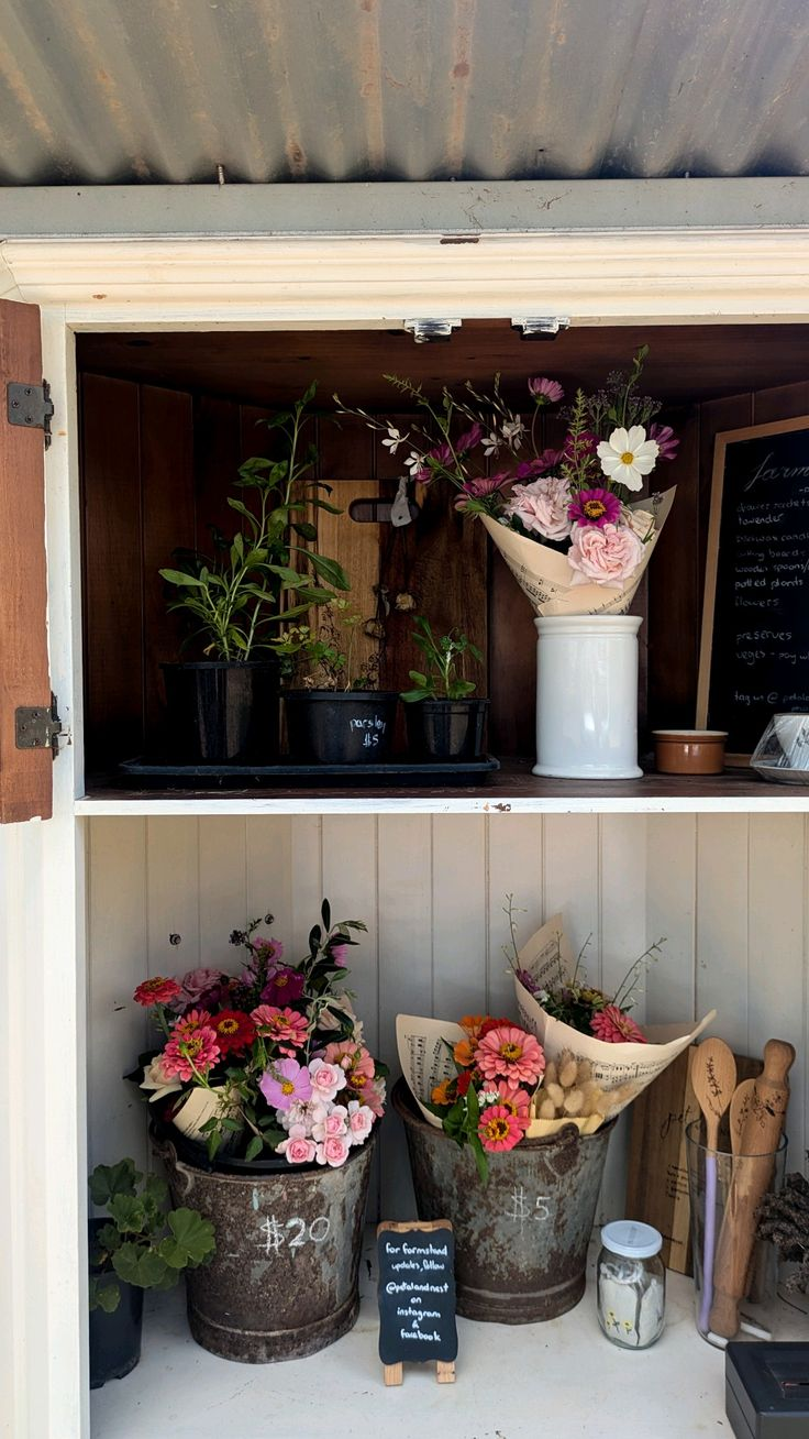
A rustic decorative element works when it supports the product—when it feels like it belongs there for a reason. One well-chosen piece can make a stand feel farm-real and cared for. Too many props turns into clutter and makes shoppers wonder what’s for sale.
What counts as a “good” rustic element
Pick something functional or believable on a farm:
- a galvanized bucket holding bouquets
- a vintage enamel pitcher for herbs
- a wooden cutting board as a sign base
- an old scale near your weighed items
- a simple wood crate that also acts as a riser
The best rustic pieces do double duty: they add charm and help you sell.
How to use one without stealing attention
Keep the rustic element in a supporting role:
- Place it at the edge or corner so it frames the display.
- Choose one “hero” prop, then stop. One is strong. Two starts competing.
- Match it to your stand style (wood + metal stays cohesive; random bright plastics break the mood).
Practical ways it boosts sales
A small rustic touch helps in three real ways:
- creates a stronger first impression from a distance
- makes the stand feel established and trustworthy
- encourages photos, which leads to repeat traffic and word-of-mouth
A single rustic element should feel like punctuation, not the sentence. If it doesn’t help the product look better or shop easier, it doesn’t belong on the table.
Keep Extra Inventory Hidden and Refill Often

Keeping extra inventory hidden solves a problem most vendors don’t realize they have: piling. When you stack produce high to look abundant, it gets bruised, warmed, and handled too much. The stand starts looking messy fast. Hidden back stock lets you keep the display clean, shallow, and fresh-looking all day.
The best rule of thumb
Make the table look “full,” but keep the actual product on display light.
- Display: what customers can shop comfortably
- Back stock: what keeps the display looking full
That keeps quality higher and reduces the picked-over look.
Where to hide extra inventory (so it stays accessible)
Good hiding spots still need fast access:
- Under the table behind a tablecloth
- Stacked crates behind the table, covered with fabric
- A cooler/tote behind your legs (for greens, berries, eggs)
- A labeled bin system: “REFILL TOMATOES,” “REFILL HERBS,” etc.
If you have to unzip bags and dig, you’ll skip refilling—and the display will suffer.
How often to refill (without hovering)
Refill in small rounds:
- every time a bin drops below about half
- after a small rush
- every 20–30 minutes during busy hours
The point is to keep the top layer looking intentional, not to keep adding height.
One habit that makes this strategy work
Never refill by dumping new produce on top. Instead:
- pull the bin forward
- rotate the best-looking items to the front
- top it up from the back stock
Hidden inventory turns your stand into a quiet, steady “always fresh” display—without bruising your product or creating visual clutter.
Use Price Bundles and Group Displays

Bundles change buyer behavior because they remove the hardest part of shopping: deciding how much is “enough.” When you offer a simple deal like 2 for $X or 3 for $X, people stop doing math in their head and start grabbing.
Why bundle pricing works at farmers markets
Bundling creates a quiet win-win:
- shoppers feel they got a deal
- you move more volume with fewer transactions
- your table looks more active because people take multiple items at once
It also helps you move produce that tends to sell one-at-a-time (cucumbers, peppers, apples) by nudging people into a bigger basket.
Bundle formats that stay clean and clear
Keep it simple. The sign should be readable in one glance.
Strong options:
- 3 for $10 (classic, easy)
- 2 for $7
- Any 5 for $12 (great for mixed varieties)
- Mix & Match bundles (especially for bouquets, herbs, tomatoes)
Avoid complicated tiers that make customers ask questions.
How to display bundles so people actually follow them
Bundles need a physical cue, not just a sign.
- Group bundled items together in one section
- Use one bin or one “bundle zone” instead of scattering items across the table
- If it’s mix-and-match, keep the eligible items within arm’s reach of each other
If a buyer has to walk around your stand to collect the bundle, they won’t do it.
A clean way to protect your margins
Bundle to increase quantity without discounting too hard:
- Bundle slow movers with fast movers (“bundle zone” choices)
- Keep the bundle price slightly better than singles, not dramatically lower
- Use bundles as a time-based push (late morning/near closing)
Bundles turn your display into a simple invitation: “Grab a few.” And that’s exactly what most shoppers need.
Show the “Fresh From Today” Section
A “Fresh From Today” section sells because it gives people a reason to buy now. Freshness is the biggest advantage a farm stand has over a grocery store, but many vendors bury that advantage inside the table. When you call it out clearly, shoppers treat those items like a limited chance, not a casual option.
What the section should communicate in one second
This area should say: “This is the newest harvest.”
Not “we’re fresh” in general. A specific promise wins.
Use simple wording:
- Picked today
- Fresh this morning
- Harvested today
Keep it short and bold. Long paragraphs on signs get ignored.
What to put in the “Fresh Today” zone
Choose items where freshness matters most:
- sweet corn
- berries
- greens
- tomatoes at peak ripeness
- herbs
If it’s something that holds well for days (potatoes, onions), it doesn’t belong in this section.
How to display it so it feels special (not random)
- Give it one dedicated spot: a front corner, a small crate tower, or a single basket group.
- Use one sign for the zone plus clear price tags per item.
- Keep the section tight and full. A “fresh today” area that looks half-empty sends the wrong signal.
The trust detail that increases conversions
If you can, add one tiny proof detail near the sign:
- “picked at 6 a.m.”
- “harvested this morning”
- “cut today”
That’s enough. It feels real without sounding like a sales pitch.
A “Fresh From Today” section turns freshness into a visible product feature—and it creates that quiet urgency that makes shoppers leave with a fuller bag.
Common Farmers Market Display Mistakes to Avoid
Even strong products struggle when the setup creates hesitation. These are the mistakes that quietly reduce sales the most:
- No clear pricing: if buyers can’t see the price instantly, they often walk away.
- Flat tables only: a single level makes the stand look smaller and harder to scan.
- Overstacking to look “full”: it bruises produce and makes the display look messy fast.
- Too many props: shoppers stop understanding what’s for sale.
- Mixed bins with no labels: customers dig, items get handled, and the stand looks picked over.
- Hidden farm name: you lose repeat customers because people can’t remember you.
- Signs that are decorative but unclear: pretty writing doesn’t help if it’s hard to read from two steps away.
Fixing just two of these can change the feel of your stand immediately.
Conclusion
A good farm stand display doesn’t try to impress—it tries to make buying feel effortless. When you add height, clean signage, a clear name, and a few intentional zones, your products start doing the selling for you. Keep it simple, keep it readable, and keep the front looking fresh—because the best display isn’t the fanciest one. It’s the one shoppers remember and come back to.